Tag Archives: Business Card Inspiration

What Font is Best for Business Cards?

It can be a challenging task choosing a font for your new business cards. There are often many options, and it can be unclear what you need to base your choice on.
Should you go for a classic, elegant serif font – or will that come off as old-fashioned? If you choose a more modern or contemporary font style, will your company stand out as fresh and up-and-coming, or will it make you look unprofessional?

The best way to choose a font for your business cards is to choose one that you feel represents you, or your brand. If you have a logo which you are featuring on your cards, it would also be a good idea to make sure your font has similar design characteristics.
You will also need to consider what colour to have your font – this depends again on your brand, logo and what you want to communicate visually with potential customers.
In this article we will select some stylistic fonts and discuss how these would work best on a business card, as well as how to choose a font colour.

The Psychology of Font for Business Cards

In marketing, the font you choose for your business cards (and other marketing material and promotional products) is important. The style of the typeface that you use on your cards can alter how a potential client, customer, colleague or contact will perceive you and your company. In this way, font choice is quite similar to colour, which we’ll touch upon briefly later.

For example: a modern, sans serif typeface will come across as contemporary, fun, and casual. If your company makes children’s toys, this style of font would be perfect – you could also choose a graphic, chunky font that evokes excitement and creates an aura of child-like glee.

But if your company provides financial or legal advice, the above font choice would be a big mistake. It could cause potential clients to take you less seriously, and doubt your professionalism. Instead, you’ll want to go with a simple, sleek and professional font which will make prospect clients trust you.

What Are the Different Types of Fonts?

As a general rule, serif fonts (such as Times New Roman) are perceived as more old-fashioned, dependable, and serious than sans serif fonts (such as Arial). They’re the kinds of fonts you’d likely see in older books and newspapers.

Handwriting-style fonts, such as Comic Sans MS, are the opposite: they’re perceived as very informal, fun, and fresh. They work well for small or casual businesses, such as dog groomers and children’s soft play centres.

Cursive, calligraphy or script-style fonts, like Amadeo and Studio Script, give off a romantic and feminine vibe. They’d be perfect if you’re a wedding planner or florist, for example.
Let’s now go through some examples of popular fonts and when they might be used.

Business Card Font Examples

Here are four of our favourite fonts for business cards, and the impression they might create about you or your business.

1. Avant Garde

Avant Garde is a brilliant font choice for anyone who wants something unique, but still professional. The letter spacing makes it extremely easy to read which is important on a business card.
Without being too bold, the roundness of this font makes text look approachable and it would work particularly well to draw attention to the key information on your business card.

If you have a modern, progressive brand with a fun and contemporary logo, this would be a great font choice for you.
If you feel this is for you, you may enjoy the ‘Fashion’ business card template for its modern, bright design.

2. Century Schoolbook

Century Schoolbook is the perfect example of a professional, easy to read serif font. This typeface is bold but without the chunky letters usually associated with standout font.
Although the style is similar to more commonly used fonts, it is a fantastic business card font choice for those looking to make their cards unique than, say, Times New Roman.
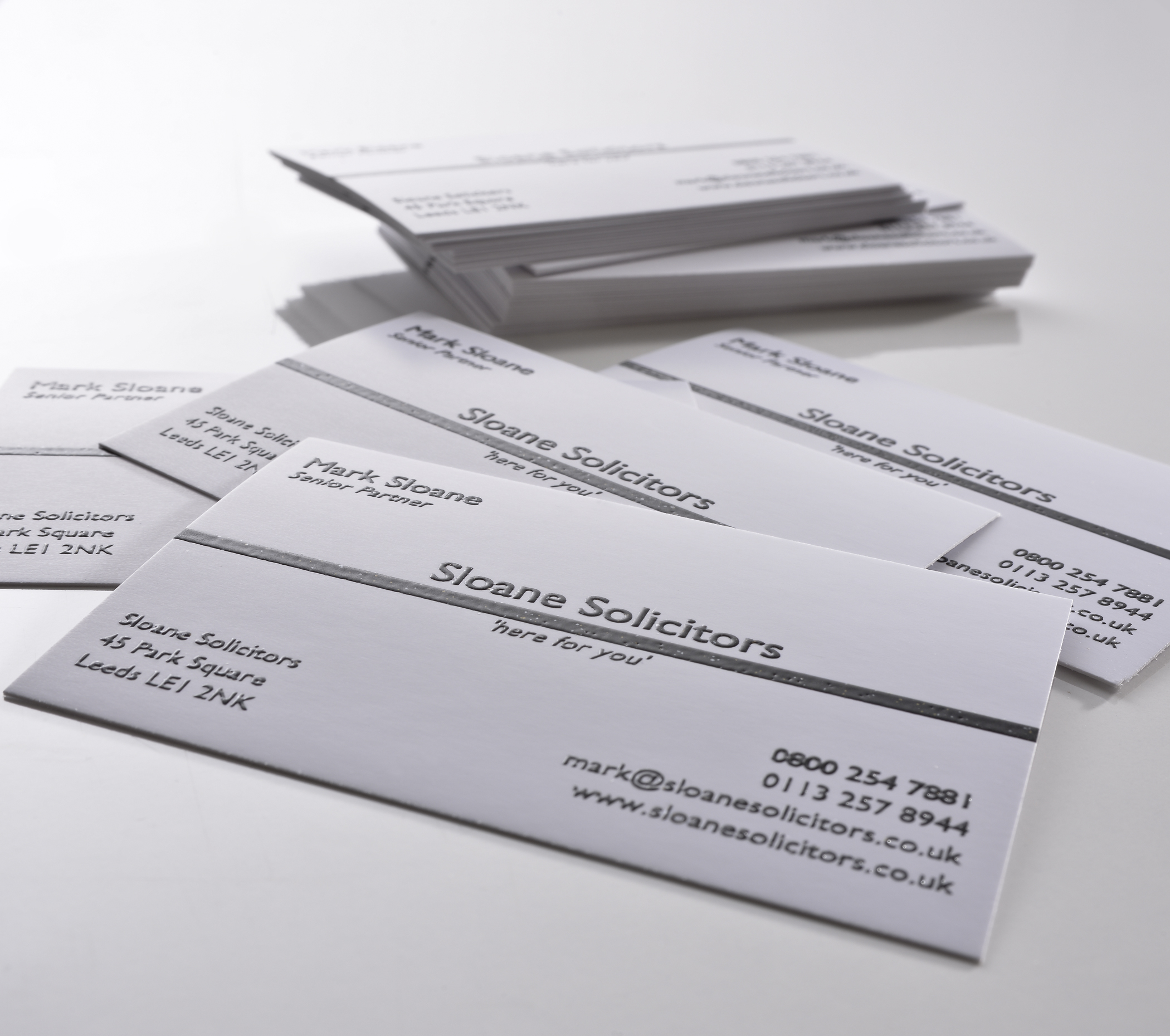
This font would work well for any professional brand, especially if you have a sleek, elegant logo. Choose a font like this for a company that needs to be taken seriously, such as an accounting firm or a solicitor.

If your brand fits this category, you may want to look at the simple yet elegant ‘Solid Black’ business card template.

3. Courier New

Courier New oozes simplicity. This typeface, which bears resemblance to typewriter font, is minimalistic in the best way. It is extremely clear and will stand out against any background.

This is a brilliant font to use for business cards as it merges playful and elegant perfectly. If your brand uses a to the point, minimal logo, Courier New would be one to consider.
For a brand with this aesthetic, the ‘Swoosh’ business card template could be a good fit.

4. Bauhaus

If you are looking for a fun and funky business card font that is still readable, Bauhaus would be an excellent choice.
It’s distinctive, striking and yet it still comes across as professional. It’s boldness means it would read clearly, even against a coloured background.

Bauhaus would make a brilliant business card font for anyone whose brand is quirky, eccentric, and fun, and would complement a bright logo.
No logo? Bauhaus would compliment the ‘Unique Antique’ business card template.

Which Font Should I Choose?

If you’re having trouble choosing, there is nothing wrong with going for a traditional and well-known typeface for your business cards. For example, Ariel or Times New Roman. They’re both classic, professional fonts that would work for almost any brand and logo.
You don’t have to go the “unique” angle if you’re worried about what your chosen font will say about your business. You can always make your business cards stand out in other ways, such as through use of colour, orientation or clever image placement.

You could also consider looking at other brands, and consider how they use font to communicate with potential customers. If you find an example that you enjoy, you can try out a similar font on your business card.

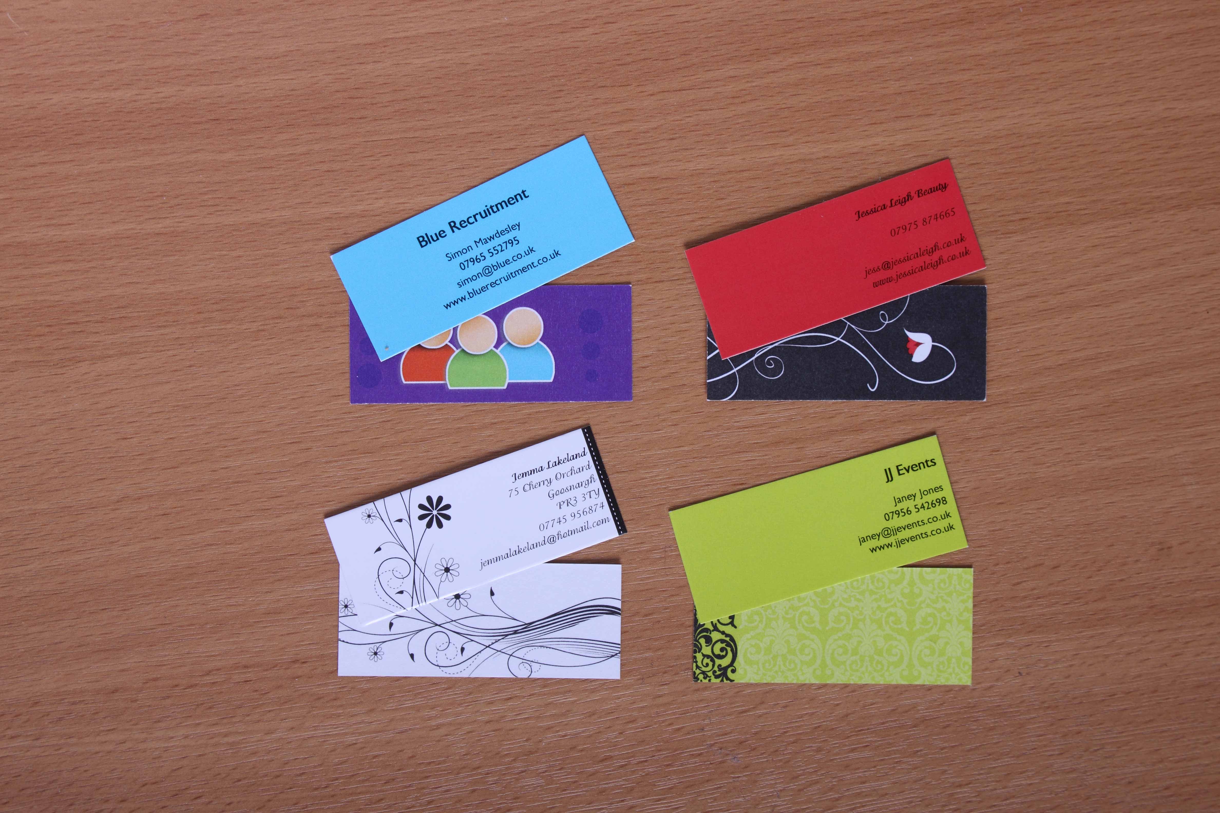
What Font Colour Should I Choose for My Business Card?

Don’t forget about colour! On a business card, it is important that all the information can be read clearly. If your clients and customers have to put in extra effort to read your information, they may not bother, and will pick up a competitor’s card instead.
It’s best to go for a font that contrasts well with your background. If your background is white or cream, a classic and professional choice would be a dark colour such as black, graphite, or navy.

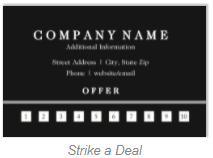
If your business card has a dark background, however (such as ‘Strike a Deal’), white (or another very light colour) would be the obvious choice.


If you do choose to go with another colour, make sure it contrasts strongly enough with the background to show up clearly on your card. As well as this, it would be best to select a colour that will accent your logo if you have one.

What Does Font Colour Tell Customers About My Business?

The psychology of colour is very interesting, and brands use colour all the time to tell their audience about their product or company. For example:

1) Black symbolises formality and sophistication
2) Purple oozes luxury and royalty
3) Red gives off an aura of energy and excitement
4) Green comes across as fresh and natural
5) Blue is a calm colour that signifies trust and honesty
6) Yellow represents fun, happiness and creativity
7) Pink symbolises love and emotion
8) Brown denotes toughness and simplicity

Business Card Colours

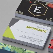
Where Can I Buy Business Cards?

At 123Print you can completely customise your own business cards to suit the experience you want potential customers to have. As well having a choice of 32 fonts and thousands of custom colours, you can also upload your own artwork and logo to make the card completely your own.

If you are not feeling so creative, you could have a look through our massive range of business card templates. All templates can still be customised so you can add your own personal touches to the design, and edit the font and colour to your liking.

You can order business cards with 123Print stress-free in the knowledge that we have a 100% customer satisfaction guarantee. Our 48-hour dispatch time and low price point means you can receive your order of high quality business cards quickly and cheaply.

Do People Throw Away Business Cards?

There’s no doubt that people do throw away business cards – especially if they didn’t ask for them in the first place. In fact, it is estimated that around 63% of people who receive business cards throw them away because they don’t think that they need the service right now.
The good news is that there are things that you can do which can increase your chances of prospects saving your cards, rather than tossing them out.
By reading on, you’ll discover the top reasons why people throw away business cards. We’ll also share our top tips on designing an impressive business card that nobody will want to throw away.

The Top 6 Reasons People Throw Away Business Cards

The first thing to address is that not every business card is going to get thrown away. Obviously, no-one would bother using business cards if nobody ever kept them.
There are several distinguishing features of business cards that make it more likely that prospects will discard the cards, instead of giving them a proper read over. Without further ado, here are the top six reasons why people throw away business cards.

1. The Design is Unprofessional

Easily one of the biggest reasons why people throw out business cards is because the design looks unprofessional. It’s easy to try to save money by doing some generic or very basic business card. However, you need to invest in a business card that is well-designed to represent your business. With a generic, unprofessional design, your card won’t stand out against the other companies out there. A memorable business card, one that is well-designed and visually appealing, won’t just get tossed aside.

2. It Doesn’t Stand Out

If your business card is printed in a basic black-and-white design, in a traditional serif font with centralised text and absolutely no distinguishing features, it’s not going to stand out. It will blend in with every other business card your peer or client has ever seen, and will not grab their attention.
This means they’re more likely to throw it away, or toss it in the back of a drawer where it’s never seen again. You can find plenty of eye-catching full colour templates here at 123Print.

3. Bad Printing

Business cards that you use for your company should not just be printed on any old printer at the office. When you do, you end up with a whole slew of problems that can have a negative impact on how people view you. For example:

1. Printed on low-gsm (thin) cardstock, giving it a flimsy feeling
2. Low-resolution or grainy images
3. Uneven text or borders
4. Variations in ink colour or quality
5. Sharp or uneven edges to the card

All of the above issues can cause people to perceive your business as unprofessional, making it less likely that they will want to work with you.

4. Lack of Added Value

Business cards are supposed to show your value to prospects. If yours doesn’t, prospects will toss your business card aside. Many businesses don’t take the opportunity to ensure that their cards are made for building up relationships with prospects.

For instance, they don’t take advantage of the back of the card, which can be used for a variety of different purposes. The backs of the cards can be used to offer discounts to prospects for checking out your business or some other appealing offer. This will ensure that prospects keep your card in a safe spot.

5. It Has Incorrect Information or Typos

If a prospect tries to get a hold of you through the contact information on your card and can’t because the information is wrong, they will throw away the card. A card with incorrect information is no good to anyone. Typographical errors and spelling mistakes will also be instantly off-putting – it makes you seem incompetent and unprofessional.
This is why it’s so important to make sure that all of the information on your cards are correct, and that you update your business cards with any new contact information. Always double- and triple-check the proof before ordering your business cards.

6. Poor Presentation of the Cards

If you don’t care about your business cards, how can you expect your prospects to? Where do you store your business cards?

Are they safely stored on you for when you need them – in a protective case, for example – or are they just tossed in your back pocket? When you pull out business cards that are folded, dirty, or wrinkled, people will not get the best impression of you. It won’t give them much reason to keep your card on hand.

How to Design a Business Card People Won’t Throw Away

The main take away from that last section is that business cards are representative of who you are as a business. This means that you need to take a great deal of care when designing your business cards. Create a design that will appeal to your prospects, so that your business cards stand out, and there’s more incentive to keep them.
Here are our top tips for creating eye-catching and professional business cards that your contacts will want to keep.

Be Creative

Don’t just design a generic business card, because you’re not going to be memorable. Memorable cards make their way on the fridge or bulletin board. Boring cards find their way in the trash. The most important thing is to be memorable and to leave a positive first impression.
You want to take the time to really come up with a creative idea that will make your business card visually appealing and leave an impact on your prospects. For example, experiment with bright and bold colour schemes that will stand out from the crowd.

Vary the Shape

You’ve probably only seen the standard rectangle business cards. But, you can do so much and have such an impact if you decide to experiment with the shapes of the cards. Rectangles may be the easiest option, but is it the best option? You can make your card a part of your brand identity by going a more creative route.
Maybe you could just go with a rectangle with rounded corners, so that it feels different in the hand. Or, perhaps choose a vertical business card, so that the recipient will have to hold it a different way to read it – this will catch their attention a lot better than a traditional horizontal card.

Add Pictures

Photos and images have a great way of adding value to business cards as they give something for people to look at on the card. These pictures could be professional headshots of you or your products, or stylistic images related to your profession. A more visually interesting card is less likely to get thrown away.
It’s really important that you take the time and money to get high quality pictures if this is the route that you’re going to take. Use a professional service like 123Print rather than attempting to print images on your office printer – it’s well worth the difference in quality.

Add Interesting Texture or Feeling

Adding textural elements to the business card is another way that you can make your business card more appealing. Interesting textures or feelings to the card can make your business card stand out.

There are different options that you can choose from, including adding embossed elements or by going with a thicker cardstock that will feel nicer in the recipient’s hand. Making your business card look and feel more interesting can inspire people to notice your business card.

Add an Incentive for Keeping the Card

Another way to guarantee that contacts will keep your business card is by adding some incentive for keeping it. This is particularly easy if you sell physical products, or you run an establishment such as a café or hair salon. Here are some ideas:
• Include a section on the card where customers can collect loyalty stamps
• Add a voucher code for 10% off their next visit – they’ll need to keep the card so that they can bring it with them
You should also add a call to action: a phrase that’s tells the reader to do something, such as “check out our full range of products here”.

Triple-Check for Mistakes

A major reason why people throw away business cards is because of the mistakes on the cards. This could be typos, or it could be mistakes with your address or contact information.
Double- and triple-check your cards to make sure that any contact information is updated and correct. It’s also important to make sure that there aren’t any misprints as this could reflect poorly on your business. Get someone else to take a look before you order – a pair of fresh eyes can be helpful.
At 123Print, we aim to dispatch all orders within 48 working hours of customer proof approval. So, within a few days, you’ll be holding your brand new business cards! Browse our full range of templates today and start perfecting your design.

5 Ways to Make Your Business Cards Stand Out

A Business Card Standing Out

When it comes to business cards making them stand out amongst the millions which float around is never an easy task. Is it design, size, shape or texture that ultimately makes a business card stand out? Or is it a mixture of several of these elements?

At 123Print UK we’ve been making business cards for a long time, and we like to think we know a thing or two about how to make them stand out. Take a look at a few of our ideas for making your business cards distinctive and unique. Comment if you have any of your own excellent ideas you’d like to share.

Include relevant social links

Whether you are telling a story, engaging with your audience, sharing your latest news or showcasing products or services within your Facebook or Twitter profiles, including social media links within your business cards is a great way for potential clients to get to know you and what your business can offer before they pick up the phone. You may have even been in your clients position before, you want to know if you can trust the business you may want to buy from, so a little research may be needed before hand and Twitter or Facebook profiles are a great place to start.

Tip: There’s no need to include all your social links, a simple Twitter tag or Facebook link will suffice.

Visually inspire

Business Card with A London Cab Design
Use Iconic Visuals to Make Your Business Card Stand Out

It’s easy to get caught up with meeting brand guidelines by utilising certain colours and including your logo within your business card design, however it is just as important to create something which visually inspires people to contact you. Often people may just need a plumber, or a taxi and they don’t want to rifle through a stack of business cards seeking the profession they require.

Tip: Make yourself stand out from the crowd by including iconic visuals which represent your industry or business.

Include a Premises Address

Although this doesn’t scream 21st Century in the same way that NFC technology, a QR Code, or even Social Links will, including a mailing address within your business card is one way to stand out from the crowd. Too many people try to save space or include other contact information within a business card, meaning a mailing address can be easily sacrificed.

Tip: Including a business mailing address gives people the impression that you are a real professional business and puts an element of confidence into your business card.

minibusinesscard

Go Mini… Go!

How often do you get to see a Mini Business Card? Talk about standing out from the crowd! Ideal for when you’re on the go and those moments when you never quite know whether you’ll need your business cards or not; Mini Cards are the perfect marketing tool. Sleek design, effortless for the owner and the receiver to handle (and keep), and they even have a proven habit of hanging around a lot longer than the normal business card!

Tip: The Mini Business Card is the limited in space when compared to the standard business card, so be sure to add only your critical information within the mini card to keep design fresh and sleek.

Feel the difference

Raised Print Business Cards
Literally Stand Out With Raised Print Business Cards

Make your business cards literally stand out with raised print business cards. They say first impressions count and we can’t think of a better way to make a distinctive and professional first impression than with raised print business cards. From the first touch you can tell a raised print business card is distinguishing and it exudes professionalism and quality in a way no other cards can, which goes a long way in keeping you centred in your potential clients mind. Raise your game from the first touch with these business cards.

Tip: Keep the Raised Print Business Card design simple and let the ink do the talking


Have a tip which helps your business card stand out? Comment below or tell us on our Facebook page!