The psychology of colour is a branch of study in which numerous experiments have been carried out to determine how colour affects the human psyche. These studies have shown that colours can invoke specific feelings in people, which is particularly useful when creating logos or branding materials for a business that wants customers to feel a certain way when they see their logo.
Some colours are said to have ‘warm’ qualities, others ‘cold’ ones, and some can give people a general happy feeling. Therefore, websites that sell colour palettes tend to label them in accordance with these traits. For example, the colour yellow is considered ‘warm’ and is known for making people feel cheerful.
Experts in branding and marketing have come up with some guidelines that suggest specific colours may be more suited to different types of business than others. For instance, a company that produces cold remedies might do well to use blue in its logo as blue is a popular colour used in pharmacies.
In this article, we will look at which colours might be best for logos for certain types of companies or service niches.
What Colour Logo Should I Choose for My Small Business?
As you might already have guessed, there’s no “one size fits all” answer for which colour you should choose for your logo. Think of some of the most popular companies in this day and age, off the top of your head, and you’ll notice that they’re all different.
Facebook, Twitter and other social media sites, for example, have blue logos, imparting a feeling of calm, security and trust upon their users. Apple’s logo is a flat, clean white, giving an image of quality, sophistication and ease of use. YouTube and Netflix, however, have bright red logos, exciting your brain and getting you in the mood to watch some energetic content.
It all depends on what sort of sector your business is a part of. Different colours are best applied to different types of companies. Here are some examples.
Banking and Finance Logo Colours
Blue – Blue is very commonly used in banking logos as it symbolises trustworthiness, loyalty, and integrity. This is why blue is found in the corporate colours of many banks.
Green – Green is a colour that symbolises wealth and prosperity, making it another good choice for a finance-related logo. The green colour scheme also evokes feelings of tranquillity, stability, and wellness – all traits people like to see in their finance professionals.
Technology Logo Colours
As technology is such a fast-paced industry, it makes sense that companies in this sector would want their branding materials to be as eye-catching and forward-thinking as their products.
Orange – This colour orange says, ‘daring and energetic.’ It can be associated with warmth, sunshine, and summer. Orange suggests a fun-loving person who is not afraid of taking risks to achieve their goals.
Yellow – Yellow is the colour of intellect and stimulates thought processes as well as creativity. It’s been proven that people retain information much better if they see a yellow coloured object while reading through a text.
Green – Green is related to technology because it symbolises growth, harmony, and freshness. The colour green represents a successful combination of tradition and innovation in the technology sector.
Blue – as mentioned before, blue evokes a feeling of trustworthiness and dependability. This is ideal if your technology deals with sensitive information, such as people’s personal details.
Fashion Logo Colours
For fashion brands, much like for tech companies, bright colours would be worth considering when designing logos as they are likely to make your logo stand out from the crowd.
However, when choosing colours for your fashion logo, you should select one with a ‘cool’ tone since these have a calming effect and can positively influence people.
Blue – According to research conducted by the University of Rochester, students who were told to wear blue clothing worked more diligently than those expected to wear red. The cool colour blue is also associated with stability and shows people that you are a rock they can rely on.
Purple – Purple, like blue, is said to create feelings of trustworthiness and creativity. It has been used extensively in fashion brand logos due to its association with both luxury and royalty.
Health and Beauty Logo Colours
Colours associated with health and beauty logos should show people you have a healthy lifestyle and calm mind, such as green, blue, or purple.
Green – Many colour theorists believe green to be the most restful colour for the human eye, so using it in your logo may help to encourage people to relax while using your products. It also creates an impression of good health and eco-friendliness.
Blue – Blue represents tranquillity and stability, characteristics associated with the stress-free state of being one can experience when using health and beauty products.
Purple – As with fashion, has been used by beauty brands for many years due to its association with royalty and sophistication.
Food and Dining Logo Colours
The colours associated with food and dining evoke feelings of warmth, comfort, and luxuries, such as browns and golds. However, green is also a fantastic colour for a food or dining business that offers healthier options.
Brown – Brown is a very down-to-earth colour that reminds people of wholesome ingredients used when cooking at home. The colour brown his proven to have a calming effect on the human mind and reduce stress levels.
Gold – Gold, as a metal, symbolises wealth and prosperity, so using it in your logo would communicate that your restaurant is high quality. Gold is also associated with luxury, making it a suitable choice for high-end food and dining industry brands.
Green – A green logo signifies healthiness and freshness, perfect for a company selling salads or Buddha bowls, for example. It’s also great for vegetarian and vegan companies.
Logo Design Tips for Small Businesses
The most successful logos are memorable and straightforward graphics connected by a single, concise word. Try using one consistent colour scheme for your logo to make it more recognisable and unique.
1) Colour in your logo should evoke emotions related to your product or industry. For example, if you are an organic food brand, using green in your logo would encourage people to feel a sense of trust towards your company and that what you are selling is good for their wellbeing.
2) Try to avoid using more than three colours in your logo, as doing so can make it appear busy, unprofessional, and unfocused. It’ll also be hard to find matching business stationery in multiple colours. Remember that simplicity is key when designing a logo!
3) How we perceive colour is subjective and unique to each person. Get feedback from your customers about which colours they associate with your brand before finalising your logo design. An online survey or focus group would be a great way to do this.
If you’re planning to use colour in your logo, ensure that it is consistently used throughout all of your advertising mediums. Doing so will allow members of the public to connect specific emotions with your company as a whole.
Where Can I Buy Professional Business Stationery with My Logo?
Choosing the right colour scheme for your logo is an important decision, so don’t hesitate to seek the advice of a professional when selecting it.
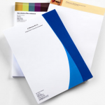
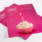
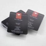
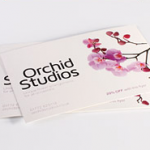
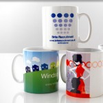
At 123Print, we are experts in business branding and design and offer a range of fully customisable business stationery. When you’ve come up with a design, feel free to browse our extensive range of fully customisable business cards, letterheads, flyers and other business stationery. Simply choose your design to begin the easy customisation process, and upload your logo directly to your product.
After approving the proof, your order will be shipped within 48 working hours, and comes with a 100% satisfaction guarantee. There’s no better way to give your small business a head-start than by spreading your logo and branding far and wide!
