When it comes to business, appearances definitely count. One of the ways in which you can make a great impression with your potential customers and clients is by having a good, solid logo that accurately represents your brand.
Your logo should be recognisable, suit the tone of your business and stick in the mind of anyone who deals with your company. Including your logo on all of your business stationery and promotional materials is the key to spreading brand awareness!
It can be hard to pin down the difference between an okay and great business logo, but there are some general guidelines that will help you get started. A good logo is simple, memorable and conveys what your business does in a striking way. The following ten tips should help make your next project successful.
1. Keep It Simple
The best logos are the simplest ones. When it comes to designing a logo, less is more. Keep your design clean and uncluttered so that it’s easy to recognise and remember.
The reason this is better is because a busy logo will be harder to make out and could end up looking like a mess. People won’t just see your logo up close, like you see it when you’re designing it; they’ll see it from far away, e.g. on your shop signage or on posters. You want them to tell whose logo it is and what it says at a glance.
It’s also important to consider how the logo will look when it’s scaled down, as it may be used in different contexts. For example, you might have to use your logo on a sign, but also on a cup or even on a business card. Simple is better if you’ll have to shrink your logo down.
2. Use Typography Wisely
Typeface is a great way to communicate the tone of your business, so make sure you pick one that reflects your values and style.
Sans serif fonts are usually a good choice for modern businesses, while serif fonts work for more traditional, formal or official enterprises. Various scripts and handwriting-style fonts can be used to inject some personality into a logo. Just be careful not to go too crazy with the typeface – you want your logo to be easy to read, not a confusing jumble of letters.
3. Stick to One or Two Colours
Colour is another important element of logo design. Some colours are more associated with certain businesses than others—think blue for banks (because it’s calming and trustworthy), or green for eco-friendly companies.
Be conscious of the emotions you want your logo to evoke, and choose colours that reflect these feelings. You also want to make sure that the colours work well together and will look good when printed in black and white. As such, the fewer colours, the better.
4. Make it Unique
In a world full of logos, it’s more important than ever to make your business stand out. This doesn’t mean going crazy with your design or using an off-the-wall font, but simply ensuring that your logo is different from everyone else’s.
One way to do this is to play around with shapes. Instead of using a standard square or rectangle, try something more creative like an abstract shape or even a symbol. You could also use negative space to create an interesting effect.
This is why logo designers get paid an awful lot to do what they do. Balancing the need for originality with the need for simplicity is difficult!
5. Consider Symbolism
Many great logos are based around symbolism. This can be a powerful way to communicate what your business does, but without using lots of words, shapes or colours. The symbol can either be something that already means something, or just something that’s distinct and recognisable that people can associate with your brand.
For example, the Nike swoosh is instantly recognisable all over the world and stands for athleticism and high quality. It symbolises movement and forward motion, and is a very easy-to-recognise symbol.
6. Be Aware of Current Trends
Trends exist in logo design like they do in everything. Just as fashion changes over time, so too does the look of logos. For example, in the early 2000s, most business logos included 3D elements and shading. Nowadays, flat-looking, solid-colour logos are all the rage – and this will no doubt change in the future.
The key is to not get too caught up in the latest trend. Remember that you want your logo to be timeless. That doesn’t mean you can’t be inspired by current trends; just don’t go too crazy, and remember that you may have to change your logo eventually if it falls out of fashion.
7. Create a Mood Board
A mood board is a great way to get inspired and keep your ideas organised. It’s simply a board or document where you collect images, fonts and other design elements that reflect the mood you want your logo to evoke.
This can be really helpful when it comes to choosing colours and typefaces. It will also help you stay on track and make sure your logo is cohesive.
You can make a mood board with a simple piece of paper and some scissors, or use online tools like Pinterest or Adobe Creative Suite. There’s no wrong way; only the way you feel best reflects your creative process.
8. Get Feedback from Others
This is a step that so many people forget. It’s important to get feedback from other people, both from people with a design background and without.
Ask them what they think of your logo, what springs to mind when they look at it, how it makes them feel, and if there’s anything they don’t understand about it.
This is a great way to get an outsider’s perspective and see if your logo is communicating the right message. It will also tell you whether the mood you wanted to create with your logo actually came through in the finished product.
It’s also helpful to get feedback from friends and family, but bear in mind that they might just say what they think will make you happy!
9. Test it Out Thoroughly
Once you’ve created your logo, it’s important to test it out on different media platforms and in different settings. This will give you a better idea of how it will look in different contexts and whether any changes need to be made.
For example, your logo might look great on a screen, but what about on paper? Will the colours be too bright or too washed out on a t-shirt? How will it look on a website or an app? Testing is essential to make sure your logo looks good no matter where it’s used.
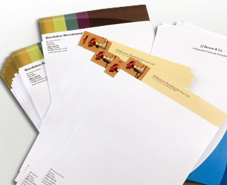
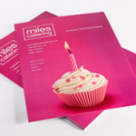
At 123Print, we offer a multitude of business stationery and promotional materials, many of which can be customised with your personal business logo. We stock thousands of customisable templates for personalised mugs, promotional postcards and more – even corporate Christmas cards! Why not experiment with a range of different stationery to see how your logo looks?
10. Have Fun With It!
This is the most important step of all. If you’re not enjoying yourself, then you’re not going to do your best work.
Logo design should be a fun and enjoyable process, and you should never be afraid to experiment. The more ideas you come up with, the better your chances of creating something truly original.
If you don’t find it fun, consider outsourcing to a designer. These days, you can find people who will make a logo for a very reasonable price, and you’ll still be able to get something that’s truly unique.
So, there you have it! Our top tips for creating an effective business logo. Follow these guidelines and your logo will stand out from the crowd and be instantly recognisable to customers and clients.
And when you’ve settled on your perfect design, don’t forget to update your business cards, flyers and other marketing materials to show off your new logo to the world!

