Tag Archives: business card design tips

What Title Should You Put on Your Business Card?

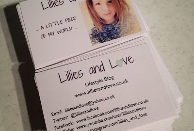
Everyone knows how important it is to have a good business card on hand. Being the extension of your business or career, you need to make sure that you’re sharing the right information on your business card, and in a way that entices people to get in touch.

Along with your name and contact information, one of the most important details in your business card is your job title. Whoever’s reading your business card will need to know who you are, and how you’re related to the company you work for! But the question is, what title should you use?

If you’re an employee, this is pretty self-explanatory: it’s whatever job title is on your employment contract. If there isn’t one, or your role has changed since you were hired, you can always ask your manager or your boss what you should put as your role.

But if you own your business, or are self-employed, things aren’t quite as simple. Today, we’ll discuss what job title options you have for your business card, and how each one might affect people’s impressions of you.

What Are the Benefits of Having a Good Business Card?

Although most of the information sharing that we do nowadays is digital, the business card remains to be one of the best tools for promoting a business, a brand or a person. Here are some of the many benefits of having a business card:

1) It helps you create a good first impression. You don’t know when you’ll get the opportunity to introduce yourself to a potential client, business partner or employer. When that time comes, you need to be ready to create a good first impression and a business card allows you to do that.

2) It helps you build and expand your network. Whether you’re an employer or employee, it’s very important to grab every opportunity to build or expand your network. A simple business card is a great tool that will allow you to exchange contact information in a more formal way than sending an email or text.

3) It helps you create the right image. With a business card, you have complete control of the design and information that you’d like to share with people. This gives you the opportunity to create the image that you want people to see, and that helps you build yourself up for success – whether you’re applying for a job or trying to impress a client.

When someone has your business card, it’s easier for them to remember to reach out to you. But you’ve got to start things off on the right foot by thinking hard about your job title.

What Is the Right Job Title to Put on a Business Card?

Since a lot is riding on that small card that you’re giving away to people you want to connect with, it’s very important to know what job title you should put on your business card. This may sound simple, but a lot of people actually get this wrong. Here are some of your best options, and when it’s appropriate to use them:

President

This title strongly conveys authority, so you should only use it when you’re already an established entity. The term “President” can be interchanged with “CEO” and putting that on a business card means that you’re on one of the highest ranks in your office.
When choosing between the two options, it’s best to think about how you’d want your organisational structure to be as you grow your business, as well as your legal business entity.

CEO

Chief Executive Officer or CEO is a title that will instantly tell people that you’re in charge of your business. Most of the time, CEOs also own the company, so if you’re going to use this job title, you need to make sure that you’re already well established in the business and that you’re managing a big team of employees.

But if you’re just starting out as a business, it’s best to avoid using CEO in your business card, as this could convey that you want to pretend that your business is larger than it is, and that you’re a “big deal” – when you might not be quite yet!

Proprietor

This is the perfect job title to put on your business card if you’re just starting as a small business, especially if you’re in retail. Although “Proprietor” is an old term that refers to the owner of a small business, it’s still used a lot today because it conveys the right authority to someone who owns the business without sounding too cocky as compared to using CEO when it’s just a small company.

Owner

Nothing gets more straightforward than this job title. It’s more than appropriate if you’re a small business owner that hasn’t filed your organisational documents just yet.
The term “Owner” has lesser gravity than “CEO” or “President,” but it still gives people the (correct) impression that you’re an authority in your business as its owner. This option is also perfect if you’re a sole proprietor, or if you’re working with only a handful of employees.

Founder

Mark Zuckerberg, Jeff Bezos and Sir Richard Branson are just some of the many famous entrepreneurs who are called “Founders” by people within and outside their companies. A “Founder” is essentially the person who first started the business.
This title is used a lot these days, especially in the tech industry where there are a lot of start-ups that grow to become bigger companies within just a few months. However, you should definitely avoid using “Founder” if you took over an established business or you simply own shares in it. This would be disingenuous.

Administrator

The term “Administrator” conveys both authority and responsibility in the business. When you put “Administrator” on your business card, you’re telling people that you have authority in the organisation, but you also take care of core responsibilities that help with your day-to-day operations.

However, this may confuse people if you’re the owner as well, as someone can work as an administrator of a company without actually owning it. It’s a great option, though, if you don’t want to intimidate people and you want to emphasise the work that you actually do day-to-day.

Director

If you want to be more specific about the role you play in the business, but you still want to convey a sense of authority, you can choose a more descriptive job title such as Managing Director, Creative Director or Technical Director. Some professionals also write it as Director of Operations or Director of Production.
Again, this role emphasises that you have a senior role in the company, but conveys slightly more information about the day-to-day duties that you oversee.

Managing Partner

You could own a business and not necessarily hold a core position within its organisation. This is when you can use the title “Managing Partner” or “Managing Member” that conveys that you’re still involved with the decision-making part of your business, although you’re leaving the operations to people you hired to be part of your team.

So, Which Title Should I Choose for My Business Cards?

The great thing about choosing a title to put on your business card is that you can be as creative as you want, except when you’ve been given a job title by your employer. Make sure to consider different factors before choosing the right label.
Remember that people place a lot of weight on the information written on a business card, so it only makes sense that you use the job title that will allow you to set good first impressions.

Whether you choose to go bold with CEO or subtle with Proprietor, remember that you have to back it up with credibility and experience.
If you’re ready to start designing your very own business cards, a great place to begin is 123Print. Feel free to browse through our huge range of business card templates for some inspiration: we stock designs for a great number of vocations and niches, from solicitors to dog groomers.

When you’ve chosen your favourite design, our easy editor will allow you to upload images (such as your company’s logo), add your personal details, and change the font colour and style to your liking. Alternatively, if nothing feels quite right, start with a blank template and create your own design entirely from scratch!

Your business cards will be professionally printed to order in your chosen quantities, and dispatched to you within 48 working hours. And if for any reason you’re not happy with the way your cards turn out, we’ll replace your order until you are, free of charge. Take the first steps to business success today with 123Print!

Product Packaging Tips for Small Businesses

When thinking about how to market your product, its packaging shouldn’t be the last thing that you consider. Even if you’re selling an online-only digital product, packing design is still relevant.

For instance, in the days when computer stores sold boxed software on DVD/CD, they needed a well-designed box to sit on the shelf. While that is no longer a reality, people still remember the packaging. Browse through computer software advertisements on the Internet, and you’ll be surprised at how many feature ‘virtual’ product packaging.

The packaging that you use will say a lot about your company – it’s one of the first impressions that customers will create about your business. Your packaging is also a great opportunity to further spread your branding and even turn customers into repeat customers!

Keep reading to discover plenty of handy tips on how to make the most out of your product packaging as a small business.

Invest in Eco-Friendly Packaging

Going back even just five years, how many vegan products would you expect to see in an average supermarket? Certainly not many, and very expensive at that compared to their non-vegan counterparts. But now every food category has a vegan/vegetarian or health-conscious alternative.

Given that this sector is more environmentally conscious than the average and consumers seem willing to pay a little more, it’s fair to assume that general consumer attitude is trending towards the environment. In today’s environmentally conscious world, this is probably one of the most relevant product packaging design tips.

How to Make Your Packaging More Environmentally Friendly

Look carefully at the materials that you’re using. Most urban houses have recycling bins—make sure that most of the product’s packing is recyclable and prominently display a recycling logo on the packaging.

Show your company’s green credentials by using recycled materials in product packaging—it’s true to say that recycled materials tend not to look and feel as pristine as non-recycled. However, being able to print ‘Made from 100% recycled material’ on the packaging is a big plus point.

Don’t forget to use recycled paper for your paper mailings, too – otherwise eco-friendly packaging may come across as a token gesture or gimmick, rather than a sign that your business is serious about the environment. At 123Print, you can purchase both letterheads and envelopes made of 100% recycled paper.

Consider the Unboxing Experience

Over the past several years, the phenomenon of the ‘unboxing video’ has become popular on social media sites such as YouTube and TikTok. Simply put, they feature a customer unboxing a new product (opening it and taking it out of its packaging), and reviewing the experience.

You might wonder why anyone would sit through a video about unboxing a product, but they have become insanely popular. Steve Jobs at Apple revolutionised this experience, designing packaging with the same care and attention to detail lavished on the product itself. This approach sets and enhances the customer’s expectations for the product.

Now consumers, especially of high-end electronic devices and luxury cosmetic products, crave this experience. When choosing between different products, in the same category, many people search for unboxing videos on YouTube. A flattering unboxing review might make the difference when choosing between similar products.

Tips for Successful Unboxings

Here are some general tips to enhance your customers’ general unboxing experience.

1) Consider the cost of packaging. The material cost of packaging, especially high-end, can reach up to 10% of the total manufacturing cost. If your product is in a price-sensitive market, would this extra cost hurt your bottom line?
2) Know your customers. What is your target consumer’s attitude to the environment? To some, the cost of high-end packaging may seem an unnecessary expense and detract from the product.
3) Be creative. YouTube is a visual medium, so your packaging material should look good under lighting, not be too reflective and feature attractive colours with a well-designed logo and font.
4) Use easy-to-open packaging such as a cardboard box. The opening process should be smooth and easy – having to hack plastic packaging open with a pair of kitchen scissors isn’t very appealing.
5) Ensure the product is secure. You don’t want it falling from the packaging upon opening. If your product features multiple parts, use packing foam inside the box and make sure that each part is visible and secure. If your product is a foodstuff, package it in a resealable bag—it looks good, is easy to open and enhances the freshness of your product.

Imagine yourself as a YouTuber, unboxing your product: what comment would you make—if the experience feels good to you, then you’re on the right track.

Theme Your Packaging

The theme is an important element of packaging design. A product’s packaging may comprise multiple items, not just a single bag or a box. It’s good to employ a consistent design with each element.

Maybe you use matching colour schemes or design elements, such as tying packages with twine. Whatever it is, remember that people like the personal touch. If your product is presented in plain packaging, it’s unlikely that your customer would choose to feature it on their Instagram feed or other social media channel.

Your product, perhaps a manual coffee grinder, might come in a well-constructed, attractive box, but also include a matching bag for travel. These small touches of design flair make a difference when trying to stand out against the competition. This might not be so important in an online marketplace, such as Amazon, where advertisers focus on the product image, rather than packaging. However, for an online marketplace, such as Etsy, which focuses on artisan products, cute and thematic product packaging, helps products to stand out from the crowd.

Make Use of Seasons and Holidays

If your product is aimed at (or sold during) a particular holiday, design the packaging with that in mind—the obvious example is Christmas, with bold red, gold and green festive designs.

But it’s not only holidays that you should think about. There are seasonal products that would benefit from appropriate design. For instance, a consumer in a DIY store, looking for, say, a garden product, would subconsciously look for green packaging.

Use Clear and Attractive Language

If you’re lucky enough that a customer has picked up your product from the shelf, make sure that all the information they need to make the choice is included on the packaging.
For instance, if it’s a health food product, make sure that it includes details of its benefits.

Otherwise, the customer might put it back and choose another brand. If you’re selling clothing, you should have a clear label stating what materials it’s made from, and the percentage of the overall product.

Like all marketing, think like a customer. While your product packaging might include a detailed instruction leaflet inside, print enough instructions on the packaging to convince the customer that it’s what they need.

Is It Legal?

While the most important aspect of packaging design is to enhance the product’s desirability, you should always consider the legal aspect. Depending on product type, certain things that appear on the packaging, such as medicinal claims, may be legally restricted.

Also, make sure that any product claims that appear on the packaging are accurate and truthful. Lying to customers for the sake of selling more units isn’t a good look.

Encourage Brand Awareness and Recognition

While your company may have a varied product line, you always want people to know from whom they’re buying. Brand awareness requires a consistent design strategy across product lines.

For instance, consider supermarkets—they offer a range of products. There is never just one brand of soup or sunblock on the shelf and, of course, you want the consumer to pick up your product first, rather than the store’s own brand, or a competitor’s.

A consistent brand identity can help with this—something familiar in the packaging, perhaps a particular font or colour scheme to grab their attention and make them reflexively reach for your product first.

While your small business might not have the research budget of a national supermarket chain, it’s valuable, when planning product packaging, to put yourself in the mind of your customer. Think about what they might look for when searching for your type of product.

And of course, always prominently display your business’s logo and any taglines or slogans you may use on the outer packaging. That way, even if the customer doesn’t end up buying it, they’ll still be more likely to remember and recognise your brand in the future.

Include Extra Promotional Materials

In order to upsell to your customers, add some additional promotional material in the product packaging. For example, you might include a flyer with a special discount code for 10% off future purchases – this will encourage your customers to place another order.

You could also consider including a loyalty card inside the packaging, with one stamp already on it. People love to collect things, and loyalty stamps are no exception. The mere presence of a loyalty card will inspire them to shop with you again, and work towards the reward (whatever it may be).

Always make sure any promotional materials you include in your packaging are professionally designed and printed, to create the most favourable impression possible with your customers. 123Print carry a full range of professional-quality flyers, business cards and other promotional materials.


Our thousands of designs are fully customisable with your own wording and font choices, and will be shipped to you within 2 working days of your order. With our 100% satisfaction guarantee, you can have confidence in us to provide for all of your marketing needs.

What Font is Best for Business Cards?

It can be a challenging task choosing a font for your new business cards. There are often many options, and it can be unclear what you need to base your choice on.
Should you go for a classic, elegant serif font – or will that come off as old-fashioned? If you choose a more modern or contemporary font style, will your company stand out as fresh and up-and-coming, or will it make you look unprofessional?

The best way to choose a font for your business cards is to choose one that you feel represents you, or your brand. If you have a logo which you are featuring on your cards, it would also be a good idea to make sure your font has similar design characteristics.
You will also need to consider what colour to have your font – this depends again on your brand, logo and what you want to communicate visually with potential customers.
In this article we will select some stylistic fonts and discuss how these would work best on a business card, as well as how to choose a font colour.

The Psychology of Font for Business Cards

In marketing, the font you choose for your business cards (and other marketing material and promotional products) is important. The style of the typeface that you use on your cards can alter how a potential client, customer, colleague or contact will perceive you and your company. In this way, font choice is quite similar to colour, which we’ll touch upon briefly later.

For example: a modern, sans serif typeface will come across as contemporary, fun, and casual. If your company makes children’s toys, this style of font would be perfect – you could also choose a graphic, chunky font that evokes excitement and creates an aura of child-like glee.

But if your company provides financial or legal advice, the above font choice would be a big mistake. It could cause potential clients to take you less seriously, and doubt your professionalism. Instead, you’ll want to go with a simple, sleek and professional font which will make prospect clients trust you.

What Are the Different Types of Fonts?

As a general rule, serif fonts (such as Times New Roman) are perceived as more old-fashioned, dependable, and serious than sans serif fonts (such as Arial). They’re the kinds of fonts you’d likely see in older books and newspapers.

Handwriting-style fonts, such as Comic Sans MS, are the opposite: they’re perceived as very informal, fun, and fresh. They work well for small or casual businesses, such as dog groomers and children’s soft play centres.

Cursive, calligraphy or script-style fonts, like Amadeo and Studio Script, give off a romantic and feminine vibe. They’d be perfect if you’re a wedding planner or florist, for example.
Let’s now go through some examples of popular fonts and when they might be used.

Business Card Font Examples

Here are four of our favourite fonts for business cards, and the impression they might create about you or your business.

1. Avant Garde

Avant Garde is a brilliant font choice for anyone who wants something unique, but still professional. The letter spacing makes it extremely easy to read which is important on a business card.
Without being too bold, the roundness of this font makes text look approachable and it would work particularly well to draw attention to the key information on your business card.

If you have a modern, progressive brand with a fun and contemporary logo, this would be a great font choice for you.
If you feel this is for you, you may enjoy the ‘Fashion’ business card template for its modern, bright design.

2. Century Schoolbook

Century Schoolbook is the perfect example of a professional, easy to read serif font. This typeface is bold but without the chunky letters usually associated with standout font.
Although the style is similar to more commonly used fonts, it is a fantastic business card font choice for those looking to make their cards unique than, say, Times New Roman.
This font would work well for any professional brand, especially if you have a sleek, elegant logo. Choose a font like this for a company that needs to be taken seriously, such as an accounting firm or a solicitor.

If your brand fits this category, you may want to look at the simple yet elegant ‘Solid Black’ business card template.

3. Courier New

Courier New oozes simplicity. This typeface, which bears resemblance to typewriter font, is minimalistic in the best way. It is extremely clear and will stand out against any background.

This is a brilliant font to use for business cards as it merges playful and elegant perfectly. If your brand uses a to the point, minimal logo, Courier New would be one to consider.
For a brand with this aesthetic, the ‘Swoosh’ business card template could be a good fit.

4. Bauhaus

If you are looking for a fun and funky business card font that is still readable, Bauhaus would be an excellent choice.
It’s distinctive, striking and yet it still comes across as professional. It’s boldness means it would read clearly, even against a coloured background.

Bauhaus would make a brilliant business card font for anyone whose brand is quirky, eccentric, and fun, and would complement a bright logo.
No logo? Bauhaus would compliment the ‘Unique Antique’ business card template.

Which Font Should I Choose?

If you’re having trouble choosing, there is nothing wrong with going for a traditional and well-known typeface for your business cards. For example, Ariel or Times New Roman. They’re both classic, professional fonts that would work for almost any brand and logo.
You don’t have to go the “unique” angle if you’re worried about what your chosen font will say about your business. You can always make your business cards stand out in other ways, such as through use of colour, orientation or clever image placement.

You could also consider looking at other brands, and consider how they use font to communicate with potential customers. If you find an example that you enjoy, you can try out a similar font on your business card.

What Font Colour Should I Choose for My Business Card?

Don’t forget about colour! On a business card, it is important that all the information can be read clearly. If your clients and customers have to put in extra effort to read your information, they may not bother, and will pick up a competitor’s card instead.
It’s best to go for a font that contrasts well with your background. If your background is white or cream, a classic and professional choice would be a dark colour such as black, graphite, or navy.

If your business card has a dark background, however (such as ‘Strike a Deal’), white (or another very light colour) would be the obvious choice.


If you do choose to go with another colour, make sure it contrasts strongly enough with the background to show up clearly on your card. As well as this, it would be best to select a colour that will accent your logo if you have one.

What Does Font Colour Tell Customers About My Business?

The psychology of colour is very interesting, and brands use colour all the time to tell their audience about their product or company. For example:

1) Black symbolises formality and sophistication
2) Purple oozes luxury and royalty
3) Red gives off an aura of energy and excitement
4) Green comes across as fresh and natural
5) Blue is a calm colour that signifies trust and honesty
6) Yellow represents fun, happiness and creativity
7) Pink symbolises love and emotion
8) Brown denotes toughness and simplicity

Business Card Colours

Where Can I Buy Business Cards?

At 123Print you can completely customise your own business cards to suit the experience you want potential customers to have. As well having a choice of 32 fonts and thousands of custom colours, you can also upload your own artwork and logo to make the card completely your own.

If you are not feeling so creative, you could have a look through our massive range of business card templates. All templates can still be customised so you can add your own personal touches to the design, and edit the font and colour to your liking.

You can order business cards with 123Print stress-free in the knowledge that we have a 100% customer satisfaction guarantee. Our 48-hour dispatch time and low price point means you can receive your order of high quality business cards quickly and cheaply.

face on business card

Should You Put Your Picture on Your Business Cards?

In a business and tech-driven world where we are bombarded with advertisements, sales pitches, and often the same old boring text on someone’s business card, it is refreshing to see that some people have tried something different. In fact, if you look around, you’ll find all kinds of interesting variations on what a standard business card might look like.
As you may imagine, the creative possibilities are endless. One popular stylistic choice for modern business cards is the addition of your photograph. Yes, you read that right – many professionals are now choosing to make an impression by uploading their own picture directly onto their business card!

But is this a good idea? What are the advantages of including your photo on a business card? Let’s find out.

How Do Photo Business Cards Work?

The idea is simple. By adding your picture to a business card, you will help potential customers remember who you are and what you do.
It’s been shown that people look at other people’s faces more than any other part of the body. In fact, right from when our eyesight begins to develop, we hard-wired to notice, recognize and pay attention to human faces.
We’re also more inclined to trust someone with whom we relate. If your potential customer, client, or professional contact sees your picture on your business card, they’re more likely to pay attention, remember and trust you.

face on business card

What’s the Psychology Behind it?

We are social creatures, and we form opinions about a person based on whether we like them or not. If you’re in sales, then the odds are that you want to develop an immediate bond with your customer so they will trust you and listen to what you have to say.
Furthermore, if people are more inclined to trust you, they will be more likely to buy from you. So, when you think about it, having your picture on the business card makes perfect sense.
If you’ve got a photo on your business card, you also instantly seem more “human” to your customers and clients – you’re not a faceless corporation any more, but an actual person.

Why Should You Use Photo Business Cards?

If you’re still not sold on photo business cards, here are the top 9 reasons why you should use them.

1. Make Your Presence Known

If you’re a salesperson whose main job is to pitch products and find customers, then it’s a no-brainer that you should use a photo on your business card.
Having your picture will make it easier for you to form an instant bond with the customer, and since you’ll be trying to get them to buy something they don’t know very much about, this will help seal the deal.
A photo business card will instantly catch the viewer’s eye, and they’re less likely to toss it aside.

2. Help Your Business Cards Stand Out

Having a picture on your card will help you stand out from the card. It will make you unique, and it will help bring you attention. Not only that, but if your business card is something memorable, there is a possibility that people might keep it for future use or even refer to your picture when trying to contact you.
Also, don’t underestimate your appearance. If you’re in sales, having a friendly smile and looking well-groomed can help sell more than just the product; it can also help sell yourself. This is especially true of younger people who are trying to make their way in the world.

3. Match Your Image to the Product

There’s one thing that you want to be careful about when using your picture on your business card, and this is making sure that it matches what you’re selling. For example, if you’re trying to sell an expensive product, having a fun-looking photo might not be appropriate because it might not reflect the kind of business you are trying to run.
If you want to use your picture and make sure it’s appropriate, then a good tip is to think about the message that your card will convey and match it with a serious look on your face or even something that exudes confidence. After all, if a person trusts what you say and your picture matches, they will be more apt to do business with you.

4. Build Trust and Form Connections

Most business cards are left in wallets or desk drawers, where they aren’t looked at until they’re needed. However, having a picture on your card means that they will see your face every time they run across it.
Having a picture on your card means that they might remember you later or be able to connect you with someone else if the need arose. This is true of people who make business cards for themselves and then give them out to everyone just to leave their own personal impression.
Making use of your cards isn’t limited to just business people. These days anyone can make and use their own card, even if they aren’t working for themselves. If you want to make an impression, then putting a picture on it is one of the best things that you can do.

5. Create a Professional Image

Over the years, many business owners have realised that having their picture on their business card helps people remember the name and gives it a more professional appearance. Dress up for the shot – do your hair, don your finest suit, and it will work wonders for your professional image.
Making yourself look more professional shows others that you are here to stay and you have legitimate products that you are selling. That can help a business grow when someone is trying to evaluate the merits of doing business with you or your company.

6. Make Your Name More Memorable

I’m sure we’ve all been in situations where we couldn’t remember someone’s name, but as soon as we saw them (or a photo of them), then we remembered it. Faces are powerful!
Putting your picture on your cards lets people remember you and associate your name with your product or service. It can also help customers and clients remember your business’s name, your logo, or even your phone number!

7. Building Rapport with Others

It’s essential to build trust and rapport when you are in the business world or anywhere else, for that matter, but it can be even more difficult if you use one of those cards with no personal connection.
When you have your picture on one of your cards, others that see it will instantly see your company as more human and personable than your competitors. They’ll associate your face with the name and company so they can remember that connection easier. They then will be more likely to trust you when they are doing business with you.

8. Reinforce Your Personality

Including your photo on your business card allows other people to see more than just what you look like. It also lets them get a feel for your personality. Making people feel more comfortable with you and your brand can be critical when evaluating what to buy. Once again, putting a photo on your card will help reinforce that personality.

Not only does it make you look better in the eyes of others, but it also helps them see how customer-friendly you really are. When they are looking at other options, your picture on the card will have an emotional impact that will make people feel more comfortable doing business with you and your company.

9. Have an Easier Time at Networking Events

One of the biggest reasons people put so much time and energy into getting their pictures taken is networking events – such as a Chamber of Commerce breakfast, a conference, or even a happy hour. It can be challenging to build relationships with other people when you don’t remember what they look like, but having your picture on the card helps a lot in this situation.

Putting your picture on the card will be a plus when you are at networking events because people will remember you better. After they come home, they’ll have dozens of business cards stuffed into their pockets, and they probably won’t remember many of the people they spoke to – but they’ll remember you, because your face is right in front of them!

Where Can I Order Photo Business Cards?

When you’re having a photo business card made, it’s not an area where you want to skimp on quality. On the contrary, it’s critical to have a high-quality photo printed on high-quality cardstock. A photograph that’s grainy, lined or badly printed will instantly make you (and your company) seem less professional.

At 123 Print, we can make the perfect photo business card to project warmth, knowledgeability, and professionalism for your business or brand. Visit our site to get started today by choosing from one of our thousands of business card templates. Simply click the “upload artwork” button to inject your personality into your chosen design!