It’s not easy choosing colours when you’re designing a logo, website or even your business cards. There are so many elements that you have to consider. Elements such as does the artwork align with my brand, will the psychology behind the colours resonate with my audience, and, of course, will the colours simply work together.
For most of us artistically immobilized fellows finding colours that match can be a real head scratcher. I personally have spent many an hour umming and ahhing over seemingly dull and lacklustre designs, frustratingly scrolling around the colour palette hoping a shade or hue will strike me as right, but often, alas, it’s not to be.
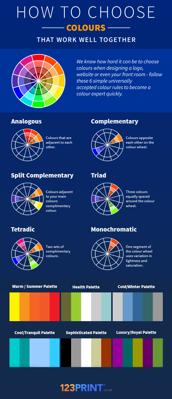
To solve this problem, I went on a quest; a quest to find a simple way of understanding how colours work and if I could find a cheat guide to quickly deciphering which colours work well together. Turns out understanding how the colour wheel works is the easiest way to spot colour combinations. Though understanding the colour wheel can take a university degree, we decided to break down the colour wheel by explaining 6 of the universally accepted colour rules to help you spot colour combinations in a glance.
Use the colour wheel by simply applying each of the Analogous, Complementary, Split Complementary, Triad, Tetradic and Monochromatic combinations to your designs.