
If this is your first time designing a business card then you’re bound to be a little apprehensive. We’ve all had the niggling thoughts such as; What goes where? Does my business card stand out? Will my business card fit with my brand? These are the most common worries that go along with making that very first impression.
At 123print UK we’ve had many years experience with business cards and we like to think we know a thing or two about how to design them! So, to make things a little bit easier, we thought we’d list our 8 ultimate business card mistakes to give you a head start when designing your business cards; the official number 1 direct marketing tool.
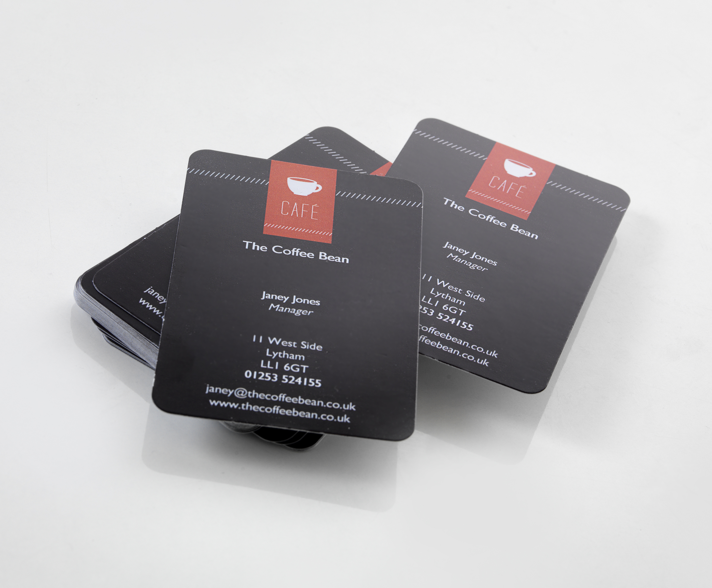
1. Unlabelled Information
If you’re industry is highly competitive and your business card is one of your number one marketing tools, then it will be no surprise that your competitors may very well be competing in the same way. With this in mind, it’s important that we remove the chance of uncertainty with business cards.
For example, if you pick up a business card and the information is not labelled correctly, or there is a discrepancy between which is your fax number and which is your phone number, then I may very well choose to phone a competitor.
Tip: Make sure you label essential contact information clearly and in the correct industry accepted format. Avoid creating confusion with the content on your cards so that it’s clear and concise.
2. Don’t Mix Business with Pleasure
As well as labelling your information correctly, it is imperative that you think carefully about what phone numbers you want to include on your business card. If you’re a busy bee and find yourself away from the office or at home for most of your working life, then it may be important to include mobile numbers.
Alternatively, people who place a higher level of privacy on their home life may want to avoid listing home phone numbers or private mobile numbers. Everyone needs a break from the hustle and bustle of work, and you don’t want to feel pressured into speaking to clients 24 hours a day!
Tip: Choose your phone numbers wisely to ensure that you’re available in the right ways and at the right times. Be careful that it doesn’t encroach on your personal life and become a nuisance with unwanted out-of-hours calls.
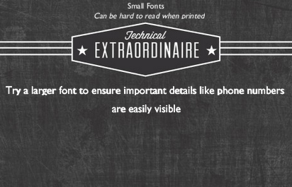
3. Small Font Size
When you pick up a business card, after the logo and design, the first thing we tend to notice is the contact information.
Having a small font can often be distracting from the overall design of the card and can come off quite tattered as it lowers the integrity. Moreover choosing a small font can be quite hard to read as they can become easily blurred, giving an overall disreputable appearance.
Tip: Choose a suitable font size that will be legible once printed and that compliments the overall design of your business card.
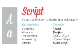
4. Script Fonts
While the font size is important, it’s even more paramount to choose a legible, clear font that stands out and delivers your message.
Refrain from opting for script fonts which have a particular flair, and handwriting effects as they can be especially hard to read when printed.
Tip: Opt for clean and crisp fonts for to detail your key information, as you don’t want critical details being missed due to an out of placed flick.
5. Too Many Fonts
To adhere with best-practice design standards and techniques, the maximum number of fonts you should be using on your business card is two. Even then you should only use contrasting fonts if they apply to brand guidelines or are differentiated by front and reverse designs. Any more than two and important information starts to become confusing, general design starts to become tatty and the overall message becomes clouded.
Tip: Stick with a distinct, clear, correctly sized and simple font style.
6. TMI – Too Much Information!
Ensuring that potential clients can contact you is essential! Of course you’ll want to get people looking at your services on your brand new website or joining in the conversation on Twitter, but there’s no need to fill every blank space with a QR code, Twitter tag and Website URL.
Tip: Be moderate with your information and keep it classy rather than desperate. Just like this blog post!
7. Non Personal Email Addresses
When you’re handing out a business card at an industry event or in a face-to-face scenario, then the recipient will be really wanting to contact YOU! A generic, branded email address such as sales@123print.co.uk or info@123print.co.uk will leave people unclear and untrusting as to who will be replying and whether their needs will be fully understood. After all, it’s you who they’ve spoken to, met with, and want to contact.
Tip: Keep your business card as a personal exchange of good faith by including your personal manned email address (even if it does go through a secretary first).
8. The Printer’s Branding
I’m sure you’ve seen the cheap, cheap, cheap business cards available from some scrupulous printing companies in exchange for your key contact information. However, one of the worst impressions you can give a potential client is that you are both cheap and unprofessional. You’re not networking to advertise someone else, but to impress with yourself and your brand.
Tip: Business cards are not overly expensive and you pay for the quality; so give the right impression and avoid including the printing company’s branding on poor quality cards.
Do you have a tip that could help others when designing business cards? Let us know below, or show us on our Facebook page!
I'll be coming over again to read additional news.
Thanks.
Appreciate the recommendations. I'll be try it out.
Got to agree, I've seen so many shoddy designs before today. Text size is vital.
When the fonts are too small it can be really annoying and I'm far more likely to throwaway. Always use a legible font as well!
'Classy rather than desperate. Just like this blog post!' – I love it. Great post and ideas. Thanks.
Wow, this piece is great. Important to highlight these things.
I don't think font is such a major issue, its the colours. Just be careful with pinks or yellows and stick with colours groupings.
Excellent post and site, thanks!
Script fonts can be legible they just need to be a big enough and in the right colours.
I've never understood QR codes on biz cards, but that's just I don't use them!
Some great ideas to avoid here. Will be taking these into account with next purchase thanks
wonderful issues altogether, you simply gained
a new reader. What would you suggest about when to renew business cards?